Choosing Abstract Art for Your Living Space: 

A Simple Guide for Modern Homes


Looking to elevate your living room with some stunning abstract art? Stop right there! Before you dive into the world of prints and canvases, let’s flip the script. 

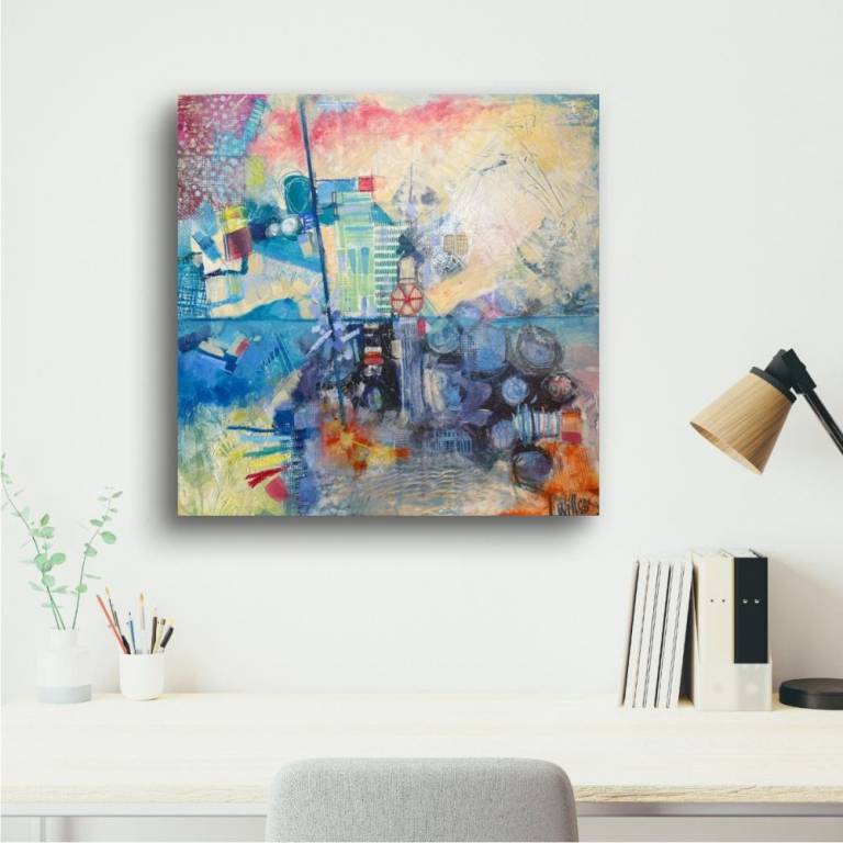
Instead of choosing art after you’ve picked your sofa, we say start with the art first! Discover why leading with a piece that resonates with you can transform your entire space into a vibrant conversation starter.

In thist blog post, I'll try to guide you through the ins and outs of selecting abstract art that not only complements your home but also captures your heart. Say goodbye to safe choices and hello to pieces that make you feel! 

Ready to make your living room a true reflection of you? What emotions do you want your art to evoke? Share your thoughts in the comments!

A piece of abstract art can cost anywhere from £50 for a print to well over £5,000 for an original mixed-media painting- and that gap matters, because how to choose abstract art for living room settings is rarely about budget alone. It's about knowing what you're actually buying into: a mood, a focal point, a conversation that happens every time someone walks into the room. Most people get this wrong because they start with the sofa.

The common mistake is treating art like a finishing touch. You pick the paint colour, choose the furniture, and then hunt for something that "goes with" everything else. The result is usually safe, flat, and forgettable.


Start With the Art, Not the Sofa

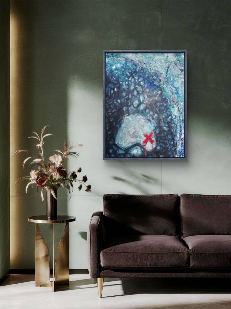
Pick the artwork first. That's the single most useful shift in thinking you can make when working out how to choose abstract art for a living room. When you lead with a piece that genuinely moves you, the rest of the room has something real to organise itself around- a colour temperature, an energy, a scale.

"Colour is my day-long obsession, joy, and torment.- Claude Monet"

That quote lands differently when you're standing in front of a painting that makes your chest do something unexpected. It's the feeling Monet was chasing, and it's the same feeling worth chasing when you're choosing art for a space you live in every day.


Why emotional resonance beats colour matching

Emotional resonance is the thing that makes you stop in front of a piece and not immediately move on. It's not the same as liking the colours. A painting might use ochre and slate blue that don't obviously match your grey sofa, but if it holds your attention for more than ten seconds, that's the one worth considering.

Colour-matched art tends to disappear into a room. It's coordinated, yes, but coordination without tension produces interiors that feel like hotel lobbies- pleasant and instantly forgettable. Abstract work that carries a genuine emotional charge creates visual tension, the productive kind that makes a room feel alive rather than staged.


Building the room around a piece you love

In practice, this means buying the artwork before you finalise anything else. If you've already furnished the room, it means being willing to move things. A painting with strong warm tones might prompt you to swap out a cool-grey throw for something in terracotta. A large-scale piece with gestural marks might mean repositioning a lamp so the light hits it properly.

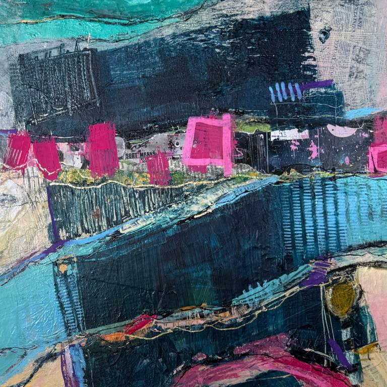
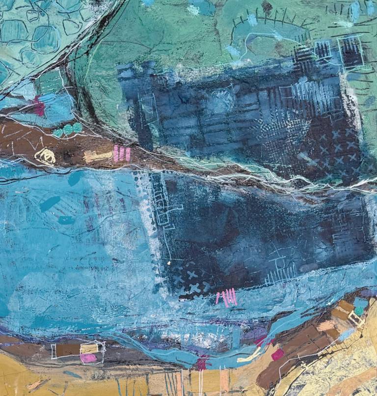
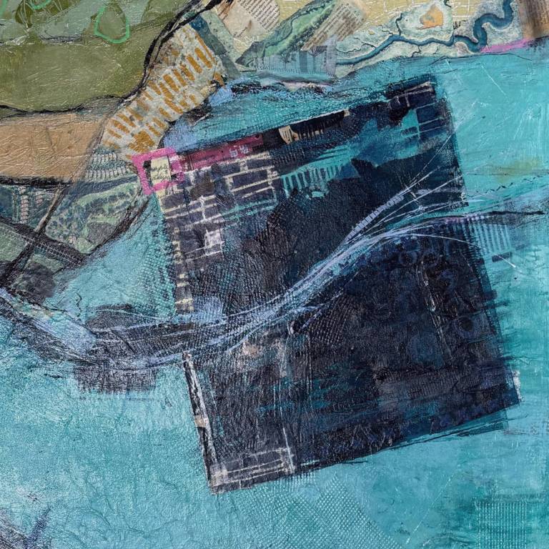
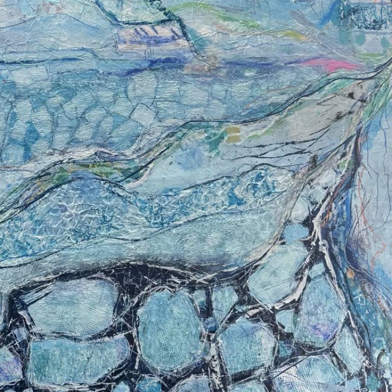
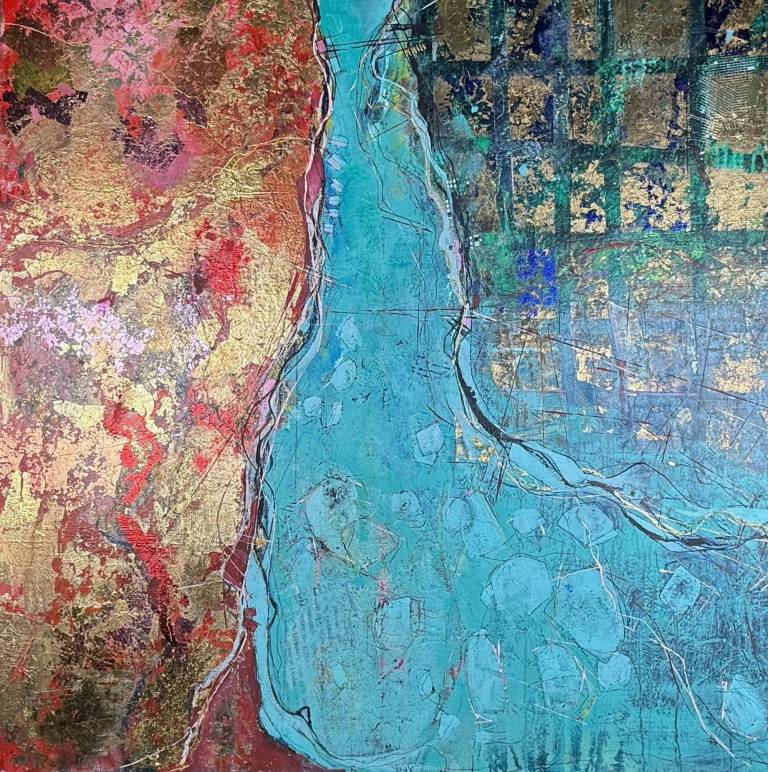
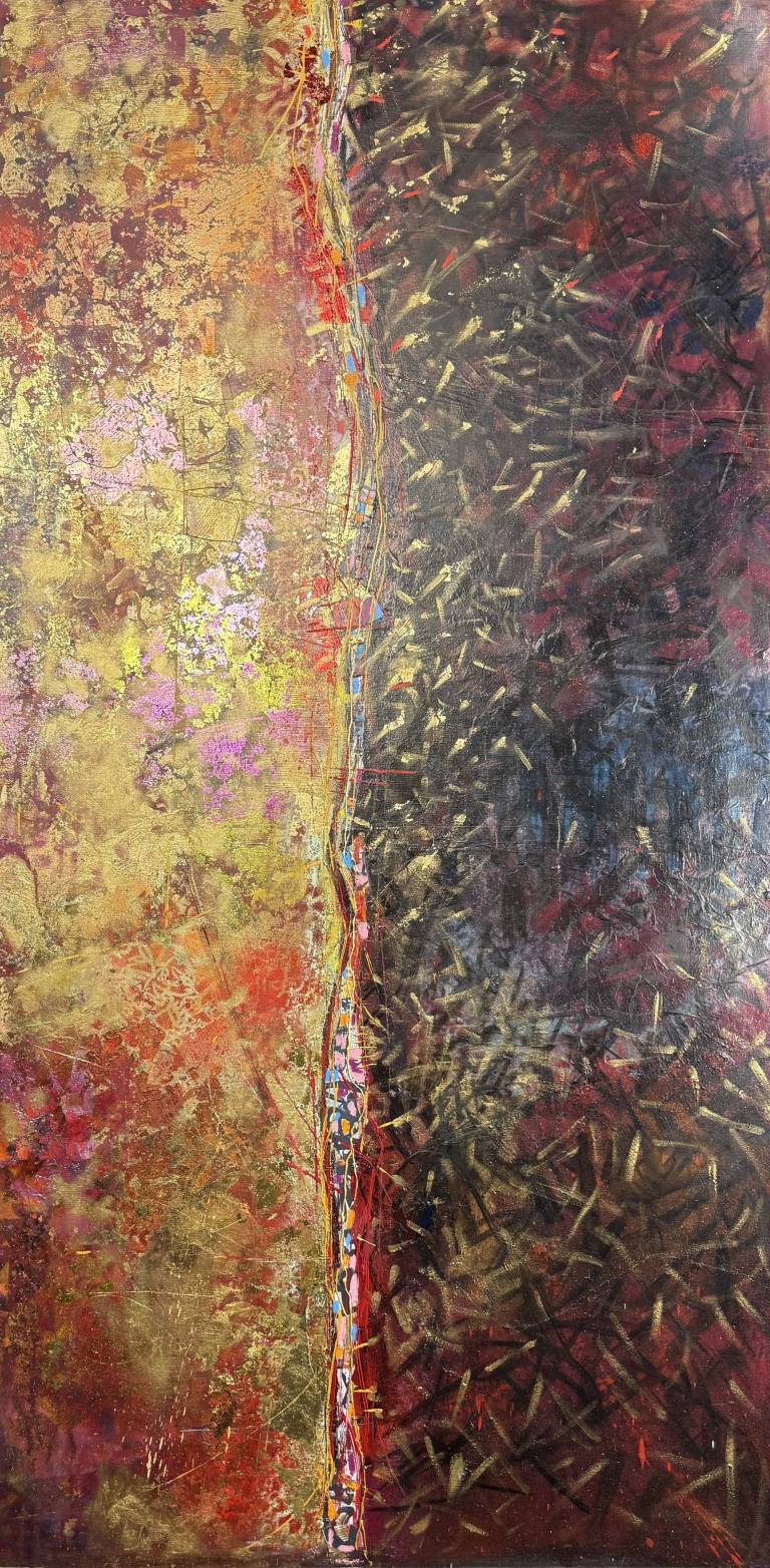
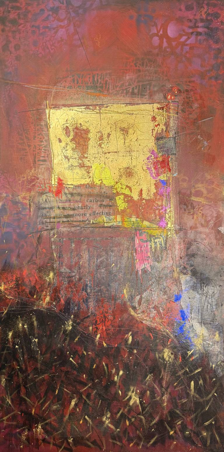
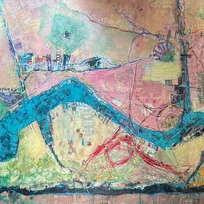
This isn't decorating. It's a different relationship with the object- treating it as the fixed point and letting the room respond. My mixed-media works, for instance, are built up with layers of paint, collage, and texture that shift depending on the light and the angle you're standing at. A piece like that doesn't just sit on a wall; it changes the atmosphere of the room around it.


Colour: Complement, Contrast, or Anchor?

There are three ways colour can work between an abstract painting and a living room, and they produce very different results. Complement means the artwork shares tones with the room. Contrast means it deliberately pushes against them. Anchor means the artwork introduces a dominant colour that everything else in the room references.


Reading your room's existing palette

Before you start looking at paintings, spend five minutes identifying what chromatic temperature your room actually runs at. Warm rooms lean into creams, terracottas, ochres, and wood tones. Cool rooms sit in greys, blues, whites, and metals. Most rooms are mixed, with one temperature slightly dominant.

The anchor approach is the boldest and, in practice, the most satisfying long-term. You buy a painting with a strong colour presence- a deep teal, a burnt sienna, an electric yellow- and you let that colour become the reference point for cushions, throws, and smaller accessories. The room grows around the art rather than competing with it.


When contrast works better than coordination

Contrast is the right call for rooms that are predominantly neutral. An all-white or all-grey living room with a large abstract piece in warm, saturated colour creates exactly the kind of tension that makes a space feel considered rather than accidental. The neutrality of the room amplifies the painting; the painting gives the room a reason to exist.

Coordination, by contrast, works when you want the art to feel integrated rather than dominant- a painting in soft sage and warm white in a room with similar tones reads as part of the room rather than a statement within it. Neither approach is wrong, but they produce genuinely different atmospheres, and it's worth deciding which one you're after before you start browsing.


Scale and Proportion: Why Getting This Wrong Ruins Everything

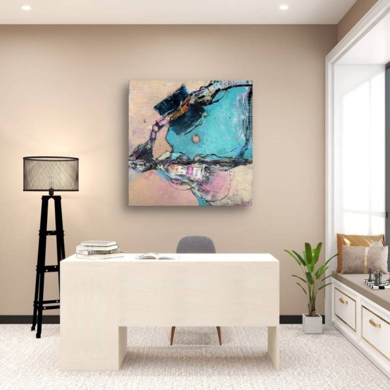
Too small is the most common mistake, and it's a harder fix than people expect. A painting that's the right colour and the right mood but sits lost on a large wall looks like an afterthought. Getting the scale right is what separates a room that feels complete from one that feels like it's still waiting for something.


Single large piece vs. a grouped arrangement

A single large piece is almost always the stronger choice for a main living room wall. It reads with more authority, creates a cleaner focal point, and tends to hold its visual weight better over time. A grouped arrangement of smaller works can work well on a narrower wall or in a space with architectural interruptions like windows or alcoves, but it requires more planning to pull off without looking cluttered.

If you do go for a group, treat the arrangement as a single object with a defined outer boundary. The gap between pieces should be consistent- roughly 5–8cm- and the overall shape of the group should have a clear logic, whether that's a grid, a horizontal band, or a loose cluster with one dominant piece at its centre.


Where and How to Hang It

Most people hang art too high. The standard rule is simple: the centre of the painting should sit at eye level, which in practice means roughly 145–150cm from the floor to the midpoint of the piece. That's it. Not higher because the ceiling is tall, not lower because the sofa is low.


Eye level is not where most people hang art

The instinct is to hang art high, especially on a tall wall. It feels more dramatic. In practice, it creates distance between the painting and the people in the room- you end up looking at the wall rather than into the work. The 145–150cm midpoint rule holds whether the ceiling is 2.4 metres or 3.5 metres.

One exception: if the painting hangs above furniture, drop the bottom edge to sit roughly 15–20cm above the top of the piece below it. This keeps the art visually connected to the furniture rather than floating above it.


Texture and Mixed Media: What Prints Can't Do

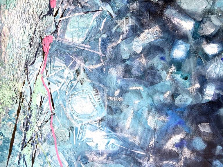
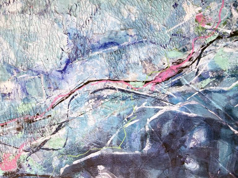
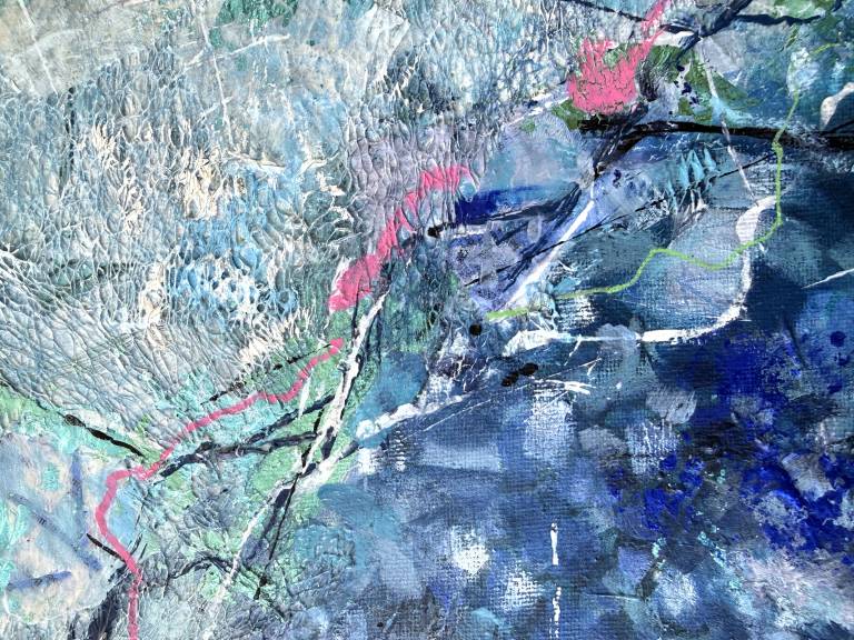
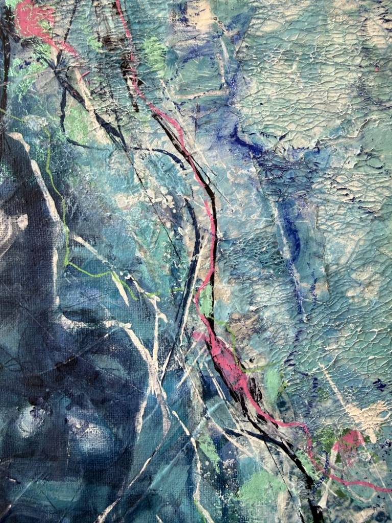
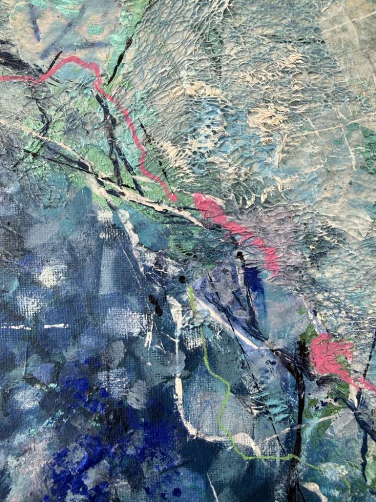
A print can reproduce colour and composition accurately. What it cannot reproduce is physical depth- the way a heavily worked surface catches light differently at 9am than at 6pm, or the way a raised edge of impasto paint creates a shadow that shifts through the day.

"Painting is silent poetry."- Plutarch

This is where mixed-media originals pull away from even high-quality reproductions. I tend to build surfaces using layers of paint, collage fragments, and textured media that interact with light in ways a flat printed surface simply cannot. The result is a painting that looks genuinely different depending on where you stand and what time of day it is.

Physical texture is the one quality that photographs cannot convey- which means you often don't fully understand a piece until it's on your wall. That unpredictability is part of the value.


Natural light vs. artificial- what each does to colour

Natural light shifts throughout the day, which means a painting in a north-facing room will look consistently cool and even- good for reading colour accurately. South-facing rooms get warm afternoon light that can intensify reds and oranges dramatically. Neither is wrong, but knowing your room's light direction changes which paintings work well in it.

Direct sunlight is the one thing to avoid. UV degradation affects both oil and acrylic paint over time, and even a few years of direct sun exposure can shift colours noticeably.


Original Painting, Print, or Commission?

Each option gives you something genuinely different, and the right choice depends on budget, intention, and how personally you want to connect with what ends up on your wall.


What you actually get with an original piece

An original painting carries something a print never can: a physical record of how it was made. Every pentimento (a visible trace of earlier paint layers), every textured edge, every collaged fragment is part of the object itself. You own the only one. That singularity affects how you relate to the work over years, not just weeks.

Provenance matters too. A signed original from a working artist holds its value in a way that even a high-quality giclée print does not.


Commissioning bespoke abstract art: how the process works

A commission starts with a conversation about your space- wall dimensions, existing colours, the mood you're after. 

My commission process works this way: you share your brief, agree on scale and a broad direction, then the artist works with genuine creative freedom within those parameters. Expect the process to take roughly six to ten weeks from agreement to delivery.

The key is trusting the artist's instinct rather than over-specifying. The most successful commissions give a direction, not a prescription.


For more detailed information or if you are considering a commission, please contact me on +44 07549 756414 or by email at tim@wlcx.art


Written: 8 July 2026


Integrating Made and Found Collage Elements into Abstract Paintings


One of the things I love most about collage is that it changes the conversation between a painting and the space around it.

Paint sits on the surface. Collage lives slightly above it.

The moment you introduce torn paper, fabric, stitched material or a found object, the painting begins to catch light differently. Tiny shadow lines appear around every edge. As daylight moves across a room, those shadows shift almost imperceptibly, giving the work a quiet sense of movement. It’s something a photograph never quite captures. You...

Choosing Materials for Mixed Media Collage


People often ask where I find the materials I use in my paintings. The honest answer is… everywhere.

I’m forever picking things up. A weathered scrap of paper caught on a fence. A piece of worn fabric. Old maps, packaging, handmade papers, even the odd offcut that’s been sitting quietly in the studio waiting for the right painting to come along.

I don’t collect these things because they’re unusual. I collect them because they already have a story.

That’s one of the joys of collage. You’re introducing materials that have lived a life...

  • 30th April 2026 to 31st July 2026

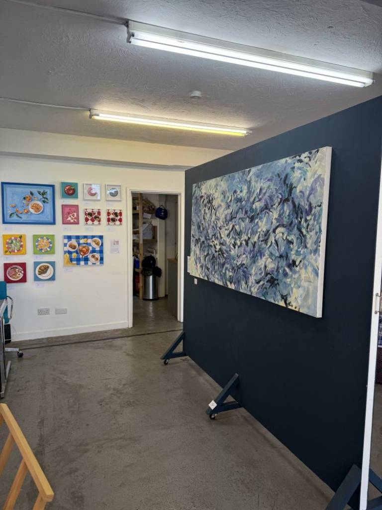
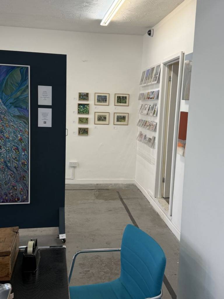
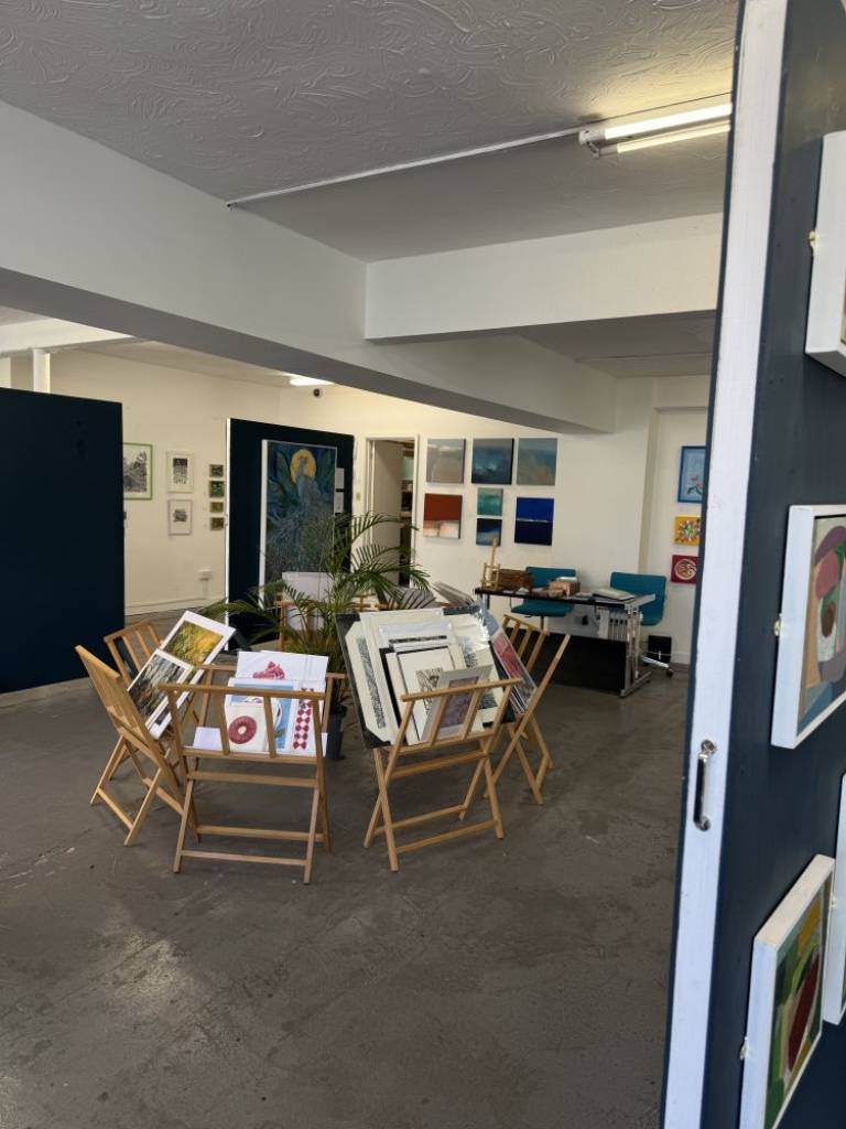
Along with several other local artists, I am currently exhibiting two of my larger paintings  from the 'Aer Edition (2026)' and two pieces of my current work 'Ice Edition (2026)' at The North Street Gallery, Bristol. open Thurs - Sun 11.00-17.00

www.northstreetgallery.com


I’m always delighted to discuss commissions and bespoke art projects. Whether you’re looking for a statement piece for your home, a large-scale work for a corporate or public space, or something created to mark a personal story or memory, I approach each commission as a true collaboration.

Every painting begins with conversation - about colour, mood, and meaning - and evolves through layers of texture and form unique to your brief. My commissioned pieces retain the same spontaneity and depth as my studio work, while being tailored to your vision and setting.

I work across abstract...

Answers to the most common questions I receive via email and feedback

Q: What inspires your paintings?
A:  Things that inspire me are many and varied but I strive to make my work tell a story, some subtle wit and often an often a social message underpinning everything 

Q: How would you describe your style of art?
A:  My paintings usually have a story behind them which, because of my background in graphic design, I tend to tell in the details. I wouldn't say I'm a 'broad brush abstract artist' but my work has a randomness, spontaneity and fluidity that develops as the theme for the painting...